The most wonderful homes are the ones that make optimal use of space while reflecting the homeowner’s personal taste and style. Over the years, as we’ve offered guidance for home renovation projects, and provided design inspiration for functional, aesthetically appealing spaces, the more we’ve observed a common thread: Many homes have a small area in the kitchen that people just aren’t sure what to do with.
You know those spaces? The ones where you think, “Should we put another cabinet there, or maybe a decorative piece of storage furniture? What about a wine rack or bookshelves?”
There’s no single correct answer to these questions. Rather, it depends on how that odd space can best serve you and your family. Here are some of our favorite kitchen workspaces, dining areas, and design ideas.
Mandatory multitasking
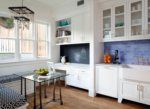
Need to transform a kitchen space that’s nearby, but far enough from where the cooking takes place? How about a breakfast nook with built-in seating, adjacent to a mini office? This highly functional cabinetry and desk provides an area to peruse recipes in a cookbook or on your laptop. Or, kids can do homework and draw on the chalkboard painted wall while you fix dinner.
These custom built-ins provide plenty of extra storage for everything from platters and vases to silverware, pencils, and colored chalk. At mealtime, the benches comfortably accommodate four, and a fifth guest can pull up the desk chair. It’s a space the whole family will enjoy.
A modern approach
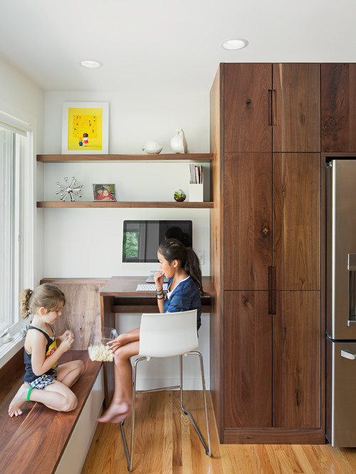
This extra space in the kitchen takes a modern, simplistic design approach and seamlessly transitions from the cabinets to a desk and window seat. The desk is counter height so you can check email while the cake is in the oven, or the kids can have a snack and do homework after school. Since the desk and bench are right by the window, there’s plenty of natural light. Just a couple simple shelves between the wall and end cabinets provide space for decorative objects.
Custom-designed kitchen zones
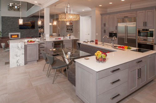
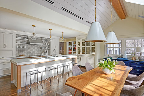
This multifunctional kitchen gets an A+ for the best use of space! Every feature in this kitchen – from the built-in banquette to the double islands and sinks – was carefully designed and zoned for food prep, dining, beverage storage, and gathering. Oh, and we almost forgot to mention the beautiful lighting, wall of framed art, and views into the family room. This open area doesn’t waste an ounce of space when it comes to countertops and cooking provisions, yet it still feels wide open and welcoming.
Contemporary meets traditional
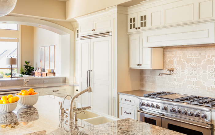
Can’t decide whether you want mid-century modern or a traditional kitchen? Why not combine them both into an inviting space for friends and family? This extra large island with double sinks is perfect for preparing meals while guests keep the cook company. On the opposite tiled wall, the cooktop is flanked by two appliance garages to keep mixers and toasters nearby, but out of sight. The far wall boasts a more traditional approach to cabinetry and shelving for dishes and glassware. We don’t often see two opposing design styles in the same kitchen, but clearly, in this case, they work well together.
Focus on the view
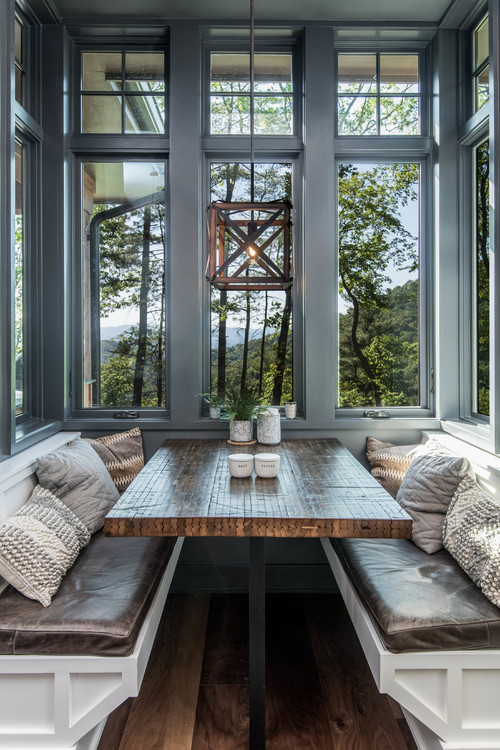
If your kitchen has a view, we say, make the most of it. Rather than putting built-in cabinets under the window, this casual dining space offers the most beautiful view in the house. The natural wood table and chandelier bring outdoor elements into the home so you can enjoy morning coffee, seemingly amongst the trees. This is such a simple use of space. It appears natural, inviting, and full of fresh air and sunlight. Who would even guess you’re still in the kitchen?
