Perhaps gray has had its day, or shades of white feel a bit too cold.
Maybe it’s because a new season is upon us or it’s simply time for a change.
Whatever the reason, our designers are seeing a move toward more earthy colors and away from cooler tones. We happen to like this earthy shift and want to share with you some of our favorite rooms that exude an inviting warmth any time of year.
Taupe is also “greige”
Did you know that another name for the taupe color family is “greige”? Think trendy gray with a warmer undertone and you get greige. Or taupe. Whichever label you choose to give it, we think it’s the perfect backdrop for nearly any style.
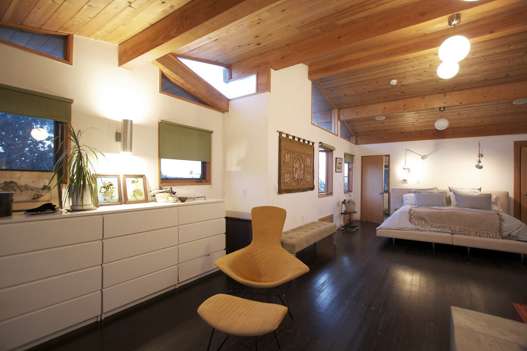
Pictured here is a mid-century modern living room with medium greige walls. Notice how easily the wall color pairs with chairs in a slightly lighter shade of the same color and the other earthtones – the brown sofa, sand-colored floor tile – all work together for a warm, yet fresh look. The earthy orange accent chair is a great choice for just the right amount of contrast.

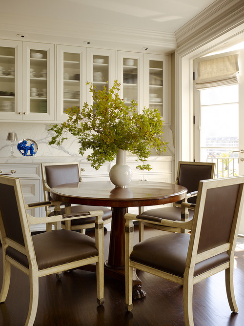
Cream is cozier than white
If you’re not quite convinced you want to completely depart from whites and grays in your kitchen, cream might be the next logical step. It’s warmer than white and naturally lends itself to other earthtones, like these lush leather dining chairs. The cream is a warm white, so you still get the benefits of bright space with the added bonus of a cozy undertone.
Cream is the perfect backdrop for other colors
Another take on a cream room color is one in which your walls provide the perfect backdrop for your favorite accent colors. In this case, reds and pinks. The room feels grounded by the natural wood coffee table centerpiece. But, your eye can’t help but be drawn upward toward the cheerful artwork over the fireplace. The warm tones of the cream walls work well with red accents so you don’t feel overwhelmed by too much contrast.

Sand as a color and a texture
This wide-open contemporary living room feels anything but stark and is filled with different textures. It begins with a warm wood floor, sand-colored overstuffed pillows on casual couches, and tops it off with dark, rustic beams overhead. In between, it all stands the light sand fireplace made of natural, hand-cut stone. This room primarily uses a monochromatic color palette except for a couple of ocean-blue accent pieces and the beach artwork on the wall. You can almost smell the salty air, can’t you?

Taupe and jewel tones are stunning together
You may have avoided taupes, greiges, and creams because it’s just not expressive enough for your personal tastes. This room is a shining example of how these neutral colors are anything but boring. On the contrary, warm taupe walls are the perfect complement to bold jewel tones like burgundy, navy, and dark teal. We love how the Greek key patterned rug breaks up the solid colors and pulls the room together in an unexpected way. If you never imagined you could put so many beautiful colors into a room with greige walls, we hope now you can.