Over the past several years, neutral tones such as beige, gray, and white have dominated interior design trends. These calming, understated hues became the go-to choice for their versatility and ability to create a minimalist, clean aesthetic. However, while neutral colors offer a timeless appeal, many homeowners are beginning to feel the need for more vibrancy and personality in their spaces. As design tastes evolve, the shift from neutrals to bolder, richer tones in colorful home design is becoming more prominent.
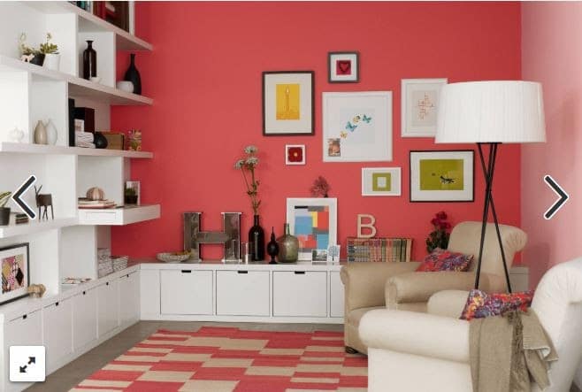
Now is the perfect time to reintegrate color into home designs. Color can transform a room, infusing it with energy, warmth, and character. Bold tones can create striking contrasts, draw attention to key areas, and more effectively reflect personal style than neutral palettes. Homeowners are increasingly seeking ways to make their spaces more dynamic, and incorporating color through key design elements is an ideal solution.
Primera’s range of products offers the perfect opportunity to add bold, vibrant colors to your home. Primera’s high-quality products provide the foundation for creating a more personalized and inviting space, whether it’s a striking countertop, a vibrant floor, or colorful cabinetry.
The Psychological Impact of Color
Color plays a decisive role in influencing mood and atmosphere within a home. Different colors evoke specific emotional responses and can shape the overall feel of a space. For instance, warm colors like reds, oranges, and yellows energize and invigorate, making them ideal for activities and socialization, such as kitchens and living rooms. Cooler colors, like blues and greens, create a sense of calm and relaxation, perfect for bedrooms and bathrooms with a tranquil atmosphere. Deep hues like emerald green or navy blue add a touch of sophistication, while vibrant shades like coral or turquoise can bring a playful, lively vibe.
Adding color in key home areas brings multiple benefits. For instance, a kitchen with bold-colored cabinets can energize and create a welcoming gathering space. Similarly, adding warm tones in the living room can make it feel cozier and more inviting. Color also helps define spaces, especially in open-concept homes. Incorporating distinct color schemes in each area allows you to create visual separation while maintaining a cohesive flow throughout the home. Overall, color adds life and personality, making spaces more engaging and inspiring.
In contrast, neutral designs, often characterized by whites, beiges, and grays, offer a minimalist, calm, and understated look. While these palettes can create a clean, timeless aesthetic, they can sometimes lack the warmth and individuality that vibrant colors provide. Neutrals offer a blank slate, but colorful interiors bring a sense of creativity, energy, and boldness. Homes with well-placed color schemes tend to feel more dynamic and personalized, creating an atmosphere that reflects the homeowner’s unique taste and character. Balancing color thoughtfully within the home can transform it from a calm, neutral retreat into an expressive, visually stimulating environment.
Colorful Cabinetry: Transforming Your Kitchen and Bathrooms
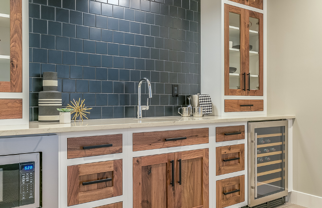
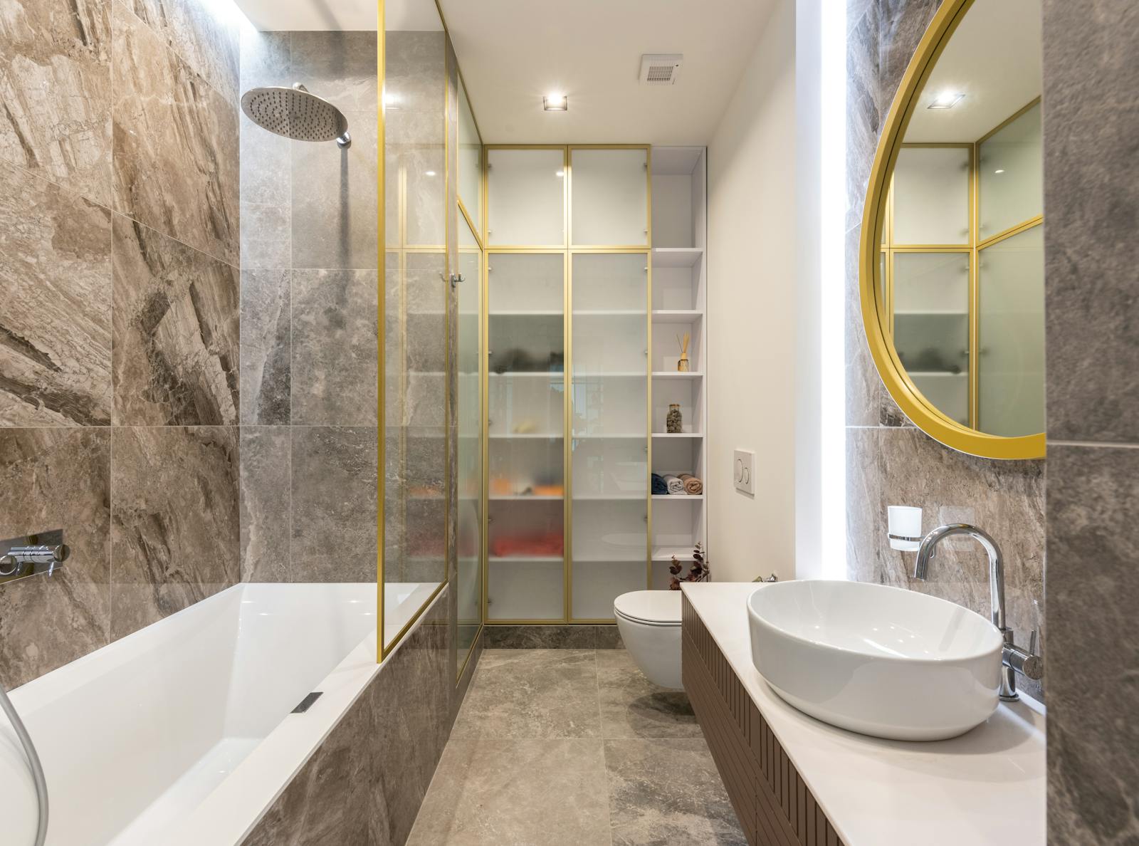
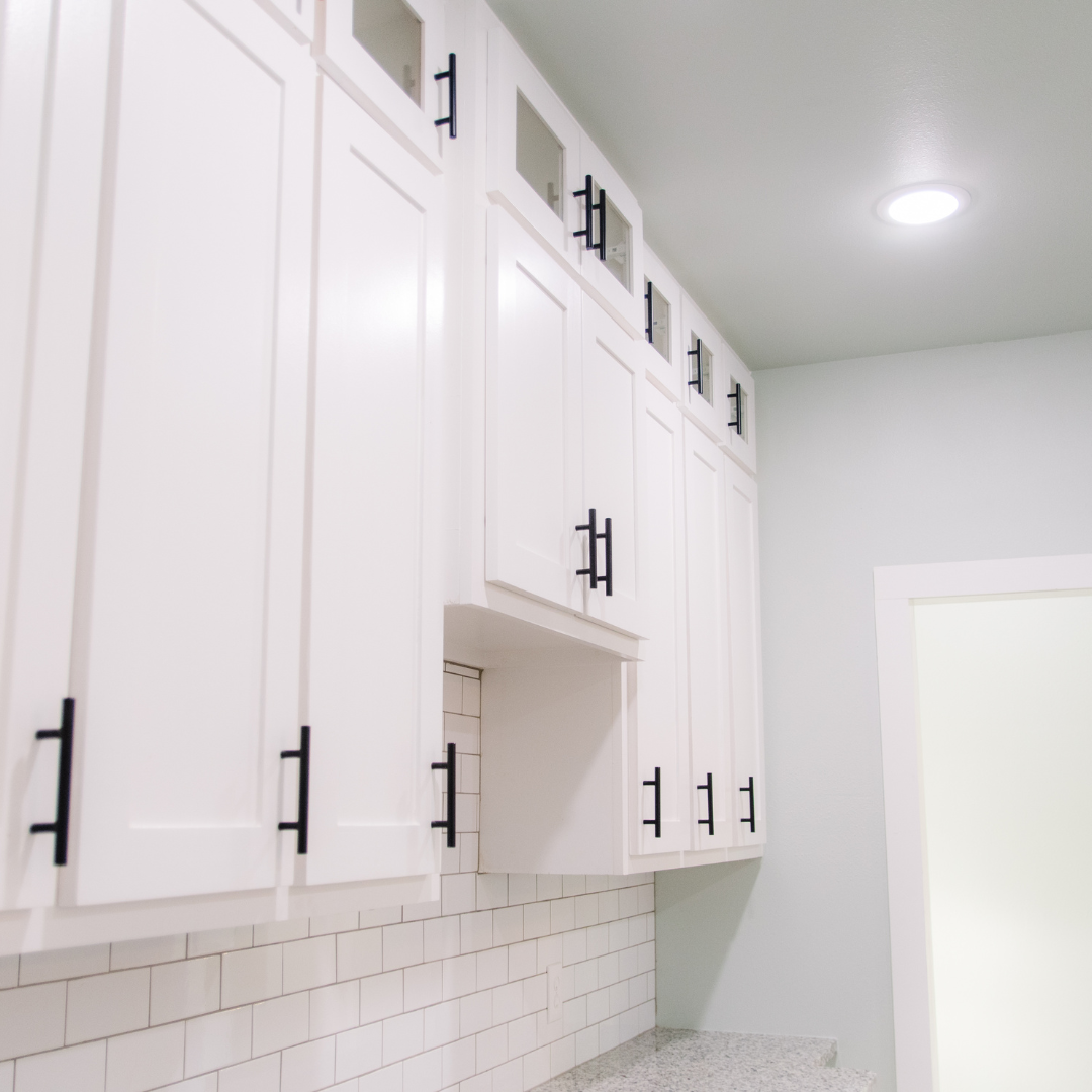
For years, neutral kitchen cabinets, think white, gray, and beige, have been the default choice for homeowners seeking a clean, timeless look. However, the trend is shifting toward bold, eye-catching cabinetry in deep blues, greens, and rich wood stains. These colors add personality to the space and can completely transform the mood of your kitchen or bathroom. Bold cabinetry makes a statement, turning these essential rooms into vibrant, inviting areas that reflect the homeowner’s style.
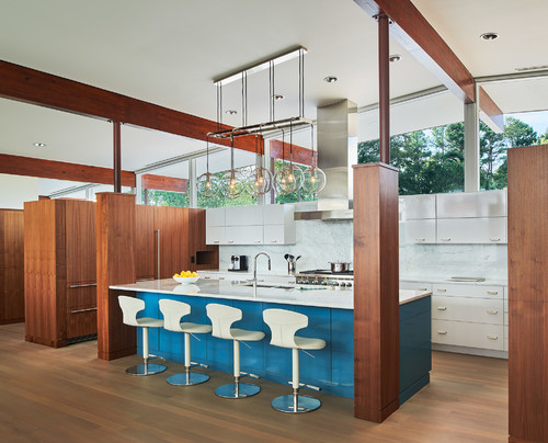
Colored cabinets can quickly become the focal point of both kitchens and bathrooms. For example, deep navy or emerald green cabinets contrast sharply against lighter countertops and walls, drawing the eye immediately. In bathrooms, dark wood-stained vanities offer warmth and elegance, becoming a centerpiece around which the rest of the décor revolves. This trend allows homeowners to step away from the conventional and experiment with color, making their spaces more customized and lively.
It’s important to harmonize the other elements in the room to balance bold cabinetry with the rest of the design. If you opt for colorful cabinets, pair them with a neutral or understated backsplash to avoid visual overwhelm. A simple subway tile or subtle geometric pattern can complement bold cabinets without competing for attention. Similarly, hardware choices, such as sleek brass or matte black handles, can enhance the overall look without distracting from the richness of the cabinetry. Regarding countertops, opt for complementary tones that are lighter marble or quartz, which can balance out dark, bold cabinets, while wooden countertops can add warmth and texture.
Ultimately, moving away from neutral cabinetry opens up endless design possibilities. Thoughtfully selected bold cabinets can make a powerful statement and create a warm, welcoming space that is uniquely yours.
Flooring: A Foundation for Color

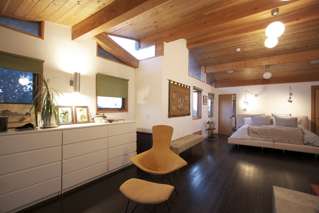
Choosing bold or warm tones in flooring is a powerful way to anchor a space and set the tone for the entire room. Whether it’s a living room, hallway, or kitchen, the flooring serves as the foundation of the design, and selecting the right materials and colors can transform the feel of the space. Bold hues like rich mahogany or warm walnut hardwoods provide a sense of warmth and luxury. Colorful tiles or luxury vinyl planks in shades of terracotta, blues, or greens can bring vibrancy and character to a room.
Primera offers a wide array of flooring options that allow you to introduce bold or warm tones into your home. Patterned tiles are an excellent choice for those looking to make a statement. These tiles can create visual interest and become a focal point, adding both color and texture to the design. Deep wood stains, such as dark oak or espresso, can bring an air of sophistication and richness, anchoring larger living spaces while maintaining a sense of warmth and comfort. For more modern or eclectic styles, colorful luxury vinyl planks offer versatility and durability, making them ideal for high-traffic areas like kitchens or entryways.
Colored or uniquely textured flooring can transform a space completely. A bold floor can ground the furniture arrangement in a living room, creating a cohesive and inviting atmosphere. Patterned or colorful flooring in kitchens can add an unexpected pop, making the space feel more dynamic and lively. Even in hallways, where design is often an afterthought, bold flooring can turn these transitional spaces into areas of interest, guiding the eye and enhancing the flow between rooms. By choosing bold tones and unique textures for your flooring, you can create spaces that are functional, visually stunning, and full of personality.
Window Treatments: Infusing Color and Texture
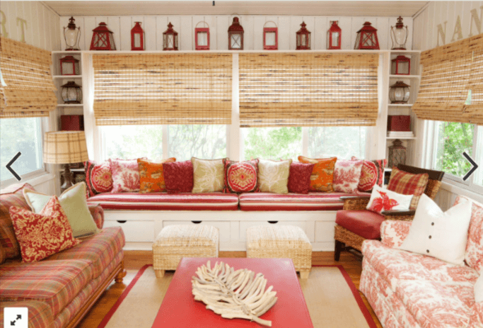
Replacing neutral blinds or drapes with vibrant window treatments can instantly elevate the look and feel of a room. Opting for deep reds, rich blues, or patterned fabrics adds a touch of sophistication and personality to your space. Whether you choose bold, solid colors or playful patterns, window treatments allow you to inject color without committing to more permanent changes, such as painted walls or colorful furniture. They can serve as both a design statement and a subtle way to introduce a pop of color to an otherwise neutral room.
Vibrant window treatments are an excellent way to add soft color to a space without overwhelming the design. For example, deep red or royal blue curtains can frame windows beautifully while adding warmth and richness to a room. Patterned fabrics, such as florals, geometric prints, or stripes, can create visual interest and texture, offering a way to incorporate multiple colors simultaneously. This approach allows you to experiment with bolder tones while maintaining a sense of balance, especially if the rest of the room’s design leans more neutral.
Beyond aesthetics, colored window treatments offer functional benefits that enhance your home’s look and feel. Heavier, vibrant fabrics like velvet or lined cotton introduce striking colors and provide light control and insulation, making them ideal for rooms that need privacy or a cozy atmosphere. Additionally, lighter-colored curtains or patterned sheers can soften harsh sunlight, diffusing natural light and creating a warm, inviting glow. Choosing window treatments in complementary colors to the rest of your room’s design ensures harmony while adding a finishing touch that ties the space together. By selecting the right color and style, your window treatments can become an integral part of your overall interior design, enhancing both beauty and comfort.
Countertops as a Statement Piece
Moving beyond basic whites or grays for countertops opens up a world of bold design possibilities. Options like deep granite, colorful quartz, or marble with dramatic veining can turn countertops into striking focal points in kitchens or bathrooms. Deep granite countertops in shades of dark green, blue, or black can add depth and sophistication, while quartz options in vibrant colors like red, teal, or gold introduce personality and energy. Marble with strong veinings, such as black on white or green on gray, creates a luxurious and dynamic look that draws the eye and enhances the overall design.
Countertop colors can be used strategically to create either contrast or harmony with cabinetry and flooring. For example, pairing deep, richly colored countertops with light cabinetry creates a high-contrast, modern look that draws attention to the countertops as a bold design element. Alternatively, choosing countertops in complementary tones to the cabinetry and flooring can create a more seamless, cohesive look, blending these key elements for a unified design. For example, pairing warm wood cabinetry with subtly veined quartz or granite can enhance the natural warmth of the space, while a dark countertop can ground lighter, brighter cabinetry and flooring.
Integrating bold countertops as a vibrant design element transforms kitchens and bathrooms into visually dynamic spaces. In the kitchen, a dark granite island can become the room’s centerpiece, especially when paired with contrasting lighter cabinets and backsplash. In bathrooms, countertops in bold marble or quartz can elevate the look of a vanity, adding a touch of luxury and modern style. Whether used as a contrasting element or as part of a cohesive color palette, bold countertops bring both functionality and artistry to these essential home spaces, making them an excellent choice for those looking to move beyond traditional, neutral designs.
Layering Color and Texture with Accessories
Primera’s products, such as cabinets, flooring, window treatments, and countertops, serve as a strong foundation for creating bold, colorful spaces. Once these elements are in place, adding color through accessories like rugs, cushions, and décor can further enhance the room’s design. Accessories provide a simple way to introduce additional layers of color and texture, making your home feel more personalized and dynamic.
To create a cohesive look, mix patterns, and colors in accent pieces to complement the primary design elements. For instance, if you’ve chosen bold cabinetry or countertops, opt for patterned cushions or rugs incorporating similar colors to tie the look together. For example, a deep blue countertop can be enhanced by adding throw pillows with blue accents, while a patterned rug with multiple shades can harmonize with both your flooring and window treatments. Mixing patterns—like geometric designs with florals—adds visual interest but ensures that the colors remain complementary to avoid clashing.
Choose items that bring out the best in bold countertops and floors without overpowering them when selecting decorative pieces. If your flooring or countertops are dark or richly colored, lighter accessories can create a striking contrast. Similarly, bright accessories like vibrant vases, artwork, or plants can highlight the depth of darker cabinetry or surfaces. By thoughtfully choosing accessories, you can create balance and add finishing touches that enhance the visual appeal of your home’s core design elements.
Creating Depth with Cabinet, Floor, and Window Treatment Combinations
Achieving a cohesive yet colorful look in home design involves carefully coordinating color and texture across cabinetry, floors, and window treatments. Primera’s vast inventory of products offers an excellent foundation for creating depth in any space by blending complementary colors and textures. By strategically layering these elements, you can achieve a balanced, dynamic atmosphere that is both visually appealing and harmonious.
One approach to layering color and texture is pairing bold cabinetry with more neutral flooring. For instance, deep blue or forest green cabinets can become the focal point in a kitchen or bathroom when balanced by light-colored or neutral flooring, such as light oak or beige tile. This contrast highlights the rich tones of the cabinetry without overwhelming the space. Similarly, you can opt for vibrant window treatments—such as deep reds or patterned fabrics—against subtle countertops to create balance while adding a pop of color to the room.
The art of coordinating bold and neutral tones lies in the layering of complementary and contrasting colors. If your cabinets are the main bold feature, choosing a more understated floor or countertop allows each element to shine without competing for attention. On the other hand, if you’re incorporating vibrant window treatments or flooring, selecting neutral or softly colored cabinetry creates a harmonious flow across the room. Mixing and matching bold and subtle design features allows you to layer colors to add depth without making the space feel cluttered or overly busy.
Balancing color across multiple elements becomes particularly important in open-concept spaces where different rooms and design elements are visible at once. To create cohesion in these environments, choosing a consistent color palette allows particular areas to stand out. For example, if your living room and kitchen share the same open space, you might choose a bold floor color in the kitchen but keep it neutral in the living room, using accent pieces like rugs and cushions to tie the two spaces together. By carefully coordinating your cabinetry, flooring, and window treatments, you can create an open-concept design that feels cohesive while still allowing for moments of bold color and creativity.
Light and Color: Maximizing the Effect of Natural and Artificial Light
Lighting plays a role in the perception and enhancement of color in your home design. Both natural and artificial light can significantly alter the colors of your cabinetry, flooring, and countertops. When designing Primera’s bold products, understanding the relationship between light and color is essential to creating the desired atmosphere.
Natural light can either brighten or soften bold colors depending on the time of day and the direction of the light. For instance, sunlight streaming into a room with deep blue or green cabinetry can create a vibrant, dynamic look during the day. However, the same space might feel more muted in the evening. Similarly, brightly colored window treatments can appear softer or more intense based on how much natural light filters through them. In rooms with lots of natural light, it’s important to consider how your chosen colors will change throughout the day to ensure an appealing design in all lighting conditions.
Artificial lighting also can enhance or tone down bold colors. Warm-toned lighting can bring out the richness in dark wood floors or cabinets, while cooler lighting might make brighter colors feel more intense. Task lighting, such as under-cabinet lighting in the kitchen, can highlight the texture and color of countertops, ensuring that bold design elements remain a focal point even in the evening. When selecting lighting, consider fixtures that complement and enhance the bold tones of your cabinetry, floors, or window treatments, helping to highlight the beauty of Primera’s products.
Transitioning from Neutral to Bold Designs with Primera Products
Transitioning from neutral interiors to more colorful designs doesn’t have to be overwhelming. Primera’s cabinets, flooring, window treatments, and countertops offer a versatile range of options that make it easy to introduce color while maintaining cohesion and gradually flowing. Starting small and building confidence with bold colors can help you create a vibrant, personalized space that reflects your style without feeling abrupt.
One of the most effective strategies for transitioning to bold designs is to begin with small areas such as bathrooms, entryways, or home offices. These spaces often allow for more experimentation and can act as a test ground for incorporating bold colors. For example, you could install deep blue or green cabinets in a bathroom paired with a neutral countertop or experiment with a patterned tile floor in a home office. These smaller areas are easier to change if needed and offer a low-risk way to explore bold color choices.
As you gain color confidence, you can expand these bold designs to larger spaces, such as kitchens or living rooms. When phasing out neutral tones, it’s essential to maintain a sense of cohesion and flow throughout the home. One way to do this is by using accent pieces and accessories to tie the spaces together. For instance, if your kitchen features bold cabinetry, you might incorporate complementary colors in the living room through accent cushions, rugs, or artwork. This strategy allows for a smooth transition between spaces without making the color shift feel too abrupt.
Additionally, using Primera’s wide selection of products ensures you can introduce color while maintaining high-quality, functional elements throughout your home. By adding a vibrant countertop, choosing colorful window treatments, or selecting bold cabinetry, you can bring the perfect balance of style and customization into your home design.
Start Introducing Colors Back into Your Designs
Primera’s wide range of products provides the ideal canvas for bringing vibrant color back into your home design. Moving away from neutral tones can transform your space into one that reflects your personality, creating a more inviting and dynamic atmosphere. Bold cabinetry, colorful flooring, patterned window treatments, and striking countertops allow you to introduce individuality and creativity into key areas of your home, making each space unique and visually appealing.
Embracing color doesn’t have to be daunting. Start small by introducing bold tones in bathrooms, kitchens, or home offices, and gradually expand to larger spaces as your confidence grows. Balance is key—pair vibrant elements with neutral or subtle counterparts to avoid overwhelming the design. Thoughtful coordination between cabinets, floors, window treatments, and countertops ensures a cohesive look, while accent pieces can tie different areas together.
With Primera’s products, you can create a colorful and harmonious home. By layering complementary colors and textures and considering how light enhances bold design choices, you’ll achieve a beautiful, personalized space that is vibrant yet balanced. Now is the perfect time to break away from neutrals and embrace the endless possibilities of color.